By Madeline Alvarez, Staff Writer
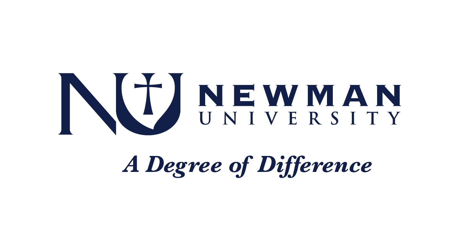
Although it’s hard to picture Newman’s logo as looking like anything other than the navy ‘NU’ and the crimson cross, this was not the University’s logo until the summer of 1998.
Prior to this, Newman University was known as Kansas Newman College, and the logo for the design was a stylized KN instead. When the name was changed to Newman University in 1998, it was decided that the logo should be changed accordingly.
Sr. Tarcisia Roths, who served as the University’s President from 1991 to 2000, helped in the decision making process of changing the logo.
“So we asked the committee to come up with a logo that would represent who we are as a university, and it was a varied committee. We included people on the campus: students, and faculty and alums so that we would get a wide variety of opinions,” Roths said.
The committee started meeting in the summer of 1998, and the logo was released in the fall of that same year.
Roths said that the committee “met several times, and they had come up with ideas and then they would have an artist use their ideas to try to come up with a logo. And the one that they finally all agreed on was the one that we use now.”
In an archived article titled “The Newman University Logo,” J.T. Klaus, an alum on the committee, explains the meaning of the design.
“In fact, if you’ll look closely, you’ll see it is neither an “N” nor a “U”,” Klaus said. “What creates the illusion of a “U” is actually the merger of an image of the chalice,” he said.
The shape is also fashioned in the same spirit as the ‘silver heart’ worn by the Adorers of the Blood of Christ,” Klaus said in the article.
The U is a “consolidation of Christ’s Cup,” embodying the foundation of the school, and it contains the crimson part, representing Christ’s blood, Klaus said in the article.
“The ‘N’ is not an ‘N’ at all, but rather a mere fragment….which cannot stand on its own but is completed by the core and foundation of the University itself…” Klaus states in the article.
Roths said she was proud of the design that the committee came up with for the new logo.
“We were all very pleased with the results of the committee’s work. They came up with several designs as they went through, and they just kept working on it and talking about it until they came up with what everybody agreed was right,” Roths said.
Klaus, who graduated from Newman in 1987, said that today he still feels the project was important.
“I remember the design artist saying, ‘You won’t know if it’s a good logo until it’s been around for 20 years.’ And I guess we did a pretty good job because we just hit the 20 year mark,” Klaus said.
This article was apart of our 50th anniversary issue where we used similar formatting to an issue from 1973. To see the full issue, formatting included, click here.